Behind the Booking Flow: A Small Sliver of a Big Redesign
Design decisions, lessons learned, and details that made the biggest impact.

Professional Project for:

Role: UX/UI Designer (Individual Contributor)
Team: Small in-house design team
Platform: iOS & Android
Timeline: 2 Years from Ideation to Release; 3 Month Design System
My Contribution:
As a UX/UI designer on a lean internal team, I contributed across the full app redesign, with a primary focus on improving the seat selection experience. This project gave me hands-on exposure to the entire product design lifecycle — from early research and IA exploration to visual systems and competitive analysis.
I took the initiative to guide major experience decisions and played a pivotal role in defining critical user flows. I collaborated closely with designers, researchers, and product leads. Participated in research synthesis, design critiques, and cross-functional decision-making. This experience deepened my skills in both user-centered design and strategic product thinking.
Overview:
Frontier’s mobile app hadn’t kept up with traveler expectations or the evolution of the brand. It lacked structure and clarity, and didn’t reflect the bold, unbundled nature of Frontier’s ultra low-cost business model.
This redesign was an opportunity to rethink what a ULCC experience ((Ultra Low-Cost Carrier) could look and feel like. The focus was on giving travelers more control, reducing friction, and creating a more modern, mobile-first journey from booking to boarding.
Writing about a project of this scale isn’t simple, there were so many moving parts, and my role shifted as different parts of the app evolved. For this case study, I’m focusing specifically on the booking flow, which was a big part of my focus throughout the project. Within that, the seat selection experience was the piece I fully owned from start to finish.
Of course, the bigger design themes carried through the whole app, but this story is about how we brought those principles to life in the booking experience, step by step.
Establishing a Foundation
Research and Discovery
Qualitative Research and Connecting with Stakeholders:
Our discovery phase was driven by deep user and stakeholder research. A dedicated UX researcher conducted extensive usability testing on the legacy app, stakeholder interviews, and conversations with loyalty members. These efforts uncovered key pain points and user needs, shaping the foundation for a more intuitive and user-centered redesign.
By the end of 2023, our researcher had compiled stacks of documentation, like the example you see here, filled with rich qualitative research insights.

Bridging Research and UI: Identifying Key Areas for Improvement
There was a disconnect in accessibility
The previous app was using font sizes that were far too small for even those with average vision.

Inconsistent Branding and Mismatched Patterns
Imagery and iconography was outdated and all over the place.
Some icons were only used on the app and no were on the website
The icons used on the website were too detailed, dramatically varied in size and

Why an In-house Design Team Made Sense
As Frontier’s needs evolved, it became clear that a more tailored, in-house approach would better support the next phase of the app experience. While the third-party team provided a solid foundation, I helped influence the shift by delivering strategic design solutions that demonstrated the value of a more embedded, responsive team model.


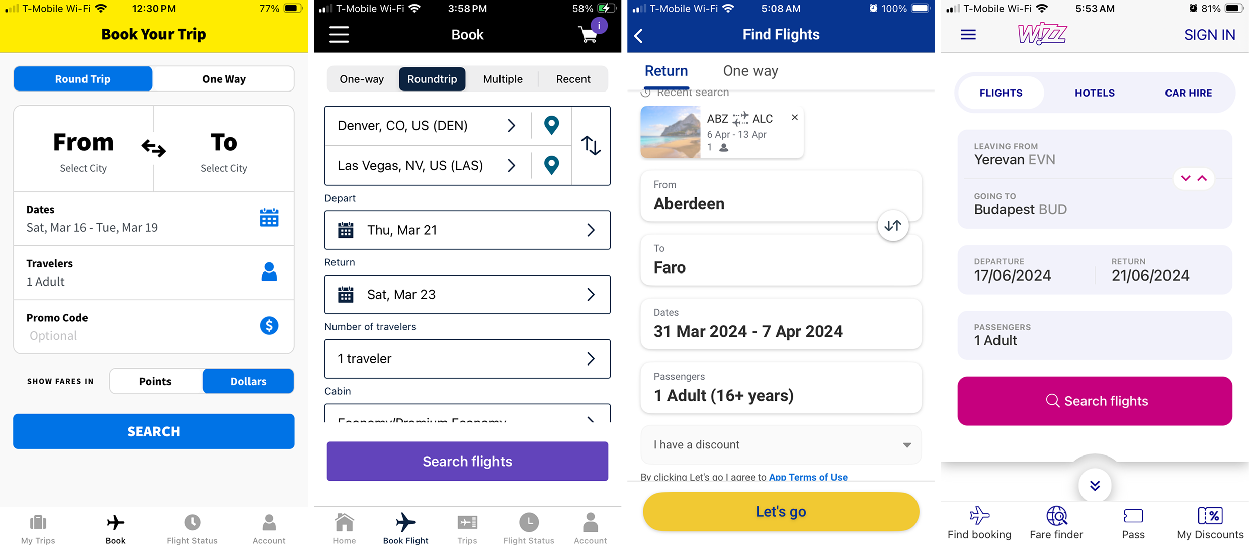
A Constant Race to Keep up with Competitive Analysis:
Every step of the process went through a thorough comparison. We broke the entire booking flow down piece by piece, looking closely at how each UI element worked in context. Our stakeholders were especially interested in how other airlines presented and represented their products, right down to the smallest details.
Even now, we’re always keeping an eye on what other airlines are doing —not to copy them— but to stay aware of ongoing trends and evolving traveler expectations. Many airlines have rolled out major digital updates in the past few years, which has been exciting to watch, but also intense to keep up with.
Note: These are some of the oldest screenshots we have and do not come close to the amount of airlines we have looked at overall.
Booking widget
Seats Flow

Bags Flow

ULCC with Ambition: Learning from Legacy Discovering Breeze Airways:
To shape our flow design, we dug into both ULCC and legacy airline experiences. Leadership often pointed to United as the gold standard — polished, full-service, and proven — but during our competitive analysis, Breeze kept standing out for us.
Breeze showed what’s possible for a ULCC: clean UI, simple and effective UX, and a more modern feel that doesn’t sacrifice clarity just because the model is unbundled. By looking across the spectrum, from Delta and United to Breeze and Spirit, we found real ways to raise the bar for Frontier’s digital experience while staying true to what makes us different.
ULCC Comparative Analysis Matrix

Breeze Airways

United Airlines

Grounding Our Designs in Real Traveler Needs:
To better understand the full range of Frontier customers, our team ran a series of collaborative FigJam mapping sessions. Using sticky notes, we explored a wide spectrum of traveler behaviors, mindsets, and habits. We captured everyone from frequent flyers to first-timers.
We mapped distinctions such as:
• Travelers who pack light vs. those who pack heavier
• First-time flyers vs. elite-status loyalty members
• Regular Frontier travelers vs. occasional deal-seekers
• One-time anonymous buyers vs. high-value repeat customers
Once we had a broad, unfiltered view of our audience, we grouped the insights into reference tables. These became a key resource throughout our process, helping us stay grounded in real user needs and pressure-test flows across critical moments, from add-on selection to seat choice.


Discovering New UI and Creating the Design System
Collaborating with Marketing, Reimagining Brand and Creating a Design System from Scratch.
Exploring the Visual Direction:
While redesigning the app, we were also working on Frontier’s new website, so our early design system exploration needed to support both at the same time.
We collaborated closely with marketing to align on brand colors, typography, and tone. At first, it was intentionally messy: mixing and matching palettes, testing fresh type combinations, and experimenting with styles that could feel modern yet still “Frontier.”
Designing the app and website side by side gave us helpful cross-references. It made clear which elements needed to stay consistent and where we could adapt things for a better mobile experience.

Building Frontier’s First Design System:
When we redesigned the app and website, we built Frontier’s first design system from scratch — giving the digital experience a clear, unified foundation for the first time.
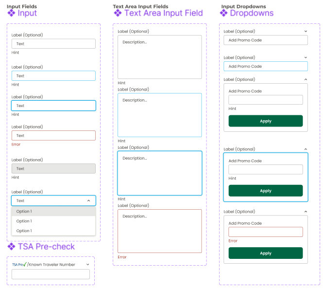
While the whole team contributed to building the design system, I owned much of the foundation, such as Typography, Iconography and all the components in the Seat Selection flow.

Building the Foundations
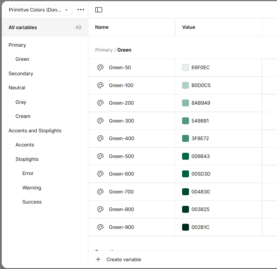
Building our Primitive and Semantic Variables:
We started this venture around the same time Fimga released Variables which was a huge win for establishing the building block but also building a shared language with development.
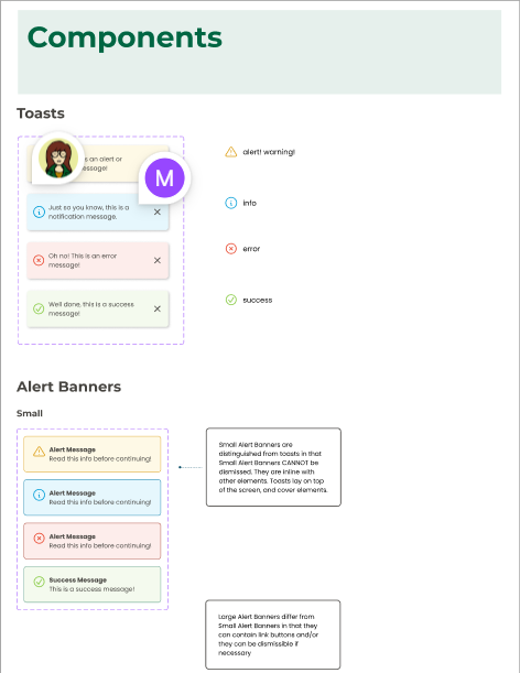
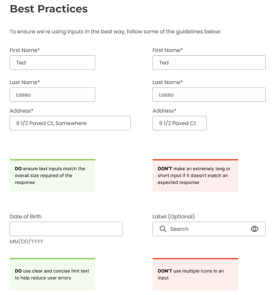
Error States and Clear Communication:
Right away we started with establishing clear communication with users through toast, banners and interactive UI states. Fast tracking future designs and establishing clear interactions for development.
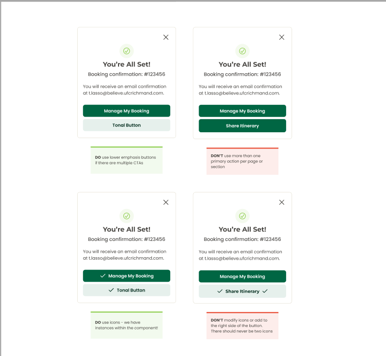
Clear Expectations and Best Practices:
Every component set we made came with a list of resources we used to establish best practices. In order to make sure those were upheld, we included Do’s and Don’ts as well as full explanations for our reasoning

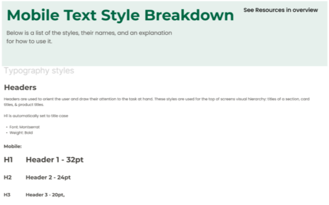
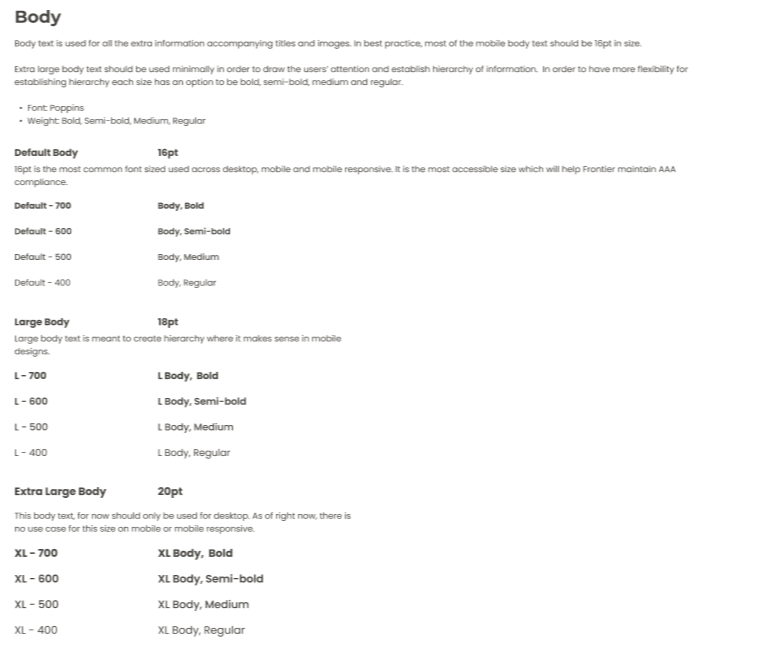
Typography
New typography: We paired Poppins (body text) with Montserrat (titles).
Montserrat, inspired by old Buenos Aires posters, adds bold character while Poppins keeps longer text clean and readable.
Naming Conventions: Were meant to establish the use-case for each font style as well as continue using a shared language with development.

Seat Selection Components
Atoms becoming Organisms: I built my components one step at a time starting with the atoms, like icons which then built all four seat maps.
Simplifying Complex Component Sets: When designing my components, I build my properties for other designers and how they might actually use the component in their day to day.
Recently, I have been looking at ways to structure my components to make them more AI friendly. Figma Make has taught me a lot about how agents read my components and develop code based on them.
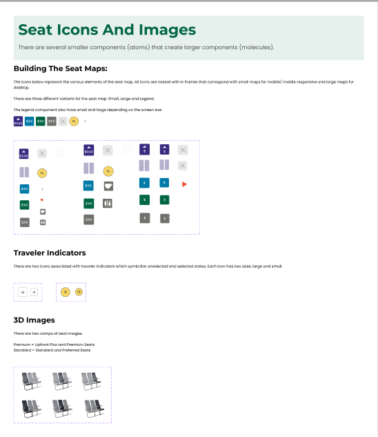


These images are pulled from a small portion of what our team built. We were able to construct a functioning, original and scalable design system within 3 months. It isn’t perfect, it is ever evolving but it did inform some of our most important strategic problem solving as we dove into the design process.
Design Iteration
Gray-scale to Hi-fidelity with a Few Curve-balls In-between
Wire-framing & Early Ideas:
Once we had our design system basics in place, we built out a simple wire-framing kit to explore different ideas quickly.
This phase let us test layouts, flows, and interactions with low effort — so we could see what worked, what didn’t, and what was worth pushing further.
We eliminated a lot of concepts early on, but wireframing also gave us space to play. One of my favorite “wacky” experiments: adding a few animal icons into the traveler information screens. They were meant to be tiny moments of delight. They didn’t last long, but they did make us smile

Iterating — And Learning When It Didn’t Work:
Like any big redesign, not every idea worked perfectly the first time. We had a tight timeline, and the app was something a lot of people cared about. Input came from stakeholders, marketing, and other designers, all at once.
At one point, we ended up with an iteration that just didn’t hold up. The flow looked fine at first glance, but the UI lacked strong usability, some heuristics were off, and the color palette, especially the blue headers, felt inconsistent and disconnected from our original intent.
The concepts behind the color choices got diluted as more voices weighed in, and we lost some of the clarity we’d built up earlier. Unfortunately, there wasn’t time for formal user testing. Instead, we did our best to step back, run a fresh heuristic evaluation, and revisit our competitive analysis to get the flow back on track.
This version taught us a lot about sticking to good usability and staying true to clear design decisions, even with a lot of input.


Final Refinements — One Small Change, Big Impact:
After going back to the drawing board, I had an idea that helped push us toward a much cleaner, more usable UI:
What if we just focused on our headers?
This inspiration came from looking at other airline apps. Many of them used simple, minimal headers — just a clear title and a single back button in the form of a chevron. When I revisited the design through the lens of heuristics, I realized this pattern checked almost every box:
Visibility of system status: Users always know where they are.
Recognition rather than recall: Clear, descriptive titles.
User control and freedom: Easy back navigation.
Flexibility and efficiency: Works across every screen.
Consistency and standards: Same interaction model throughout.
Error prevention: Fewer places to get stuck.
Aesthetic and minimal design: Less clutter, more space for what matters.
Once we established the new header style, it had a ripple effect. We realized the blue headers on our cards no longer served any purpose. They cluttered the design and didn’t add meaning. Removing them simplified the visual hierarchy and let the cards stand on their own.
This single change unlocked more space above the fold, created a smoother reading flow, and brought the whole booking experience together with more clarity and ease.
One small shift made a big impact — proving that sometimes the simplest solutions really are the strongest.


How This Shift Shaped Seats:
Simplifying the headers didn’t just clean up the app, it directly shaped how the seat selection flow came together, too.
With clearer structure up top, I could reorganize the seat map page to feel more open and easy to scan. It gave travelers more context about the seat they were choosing, or the option to skip seat selection altogether if they wanted more autonomy.
Even on a tight timeline, this gave Frontier a stronger foundation for better usability now and smarter improvements down the road.
I’ll share more about owning the seat selection redesign in a dedicated case study soon.
The selection flow:

The “skip” functionality:

Reflections:
This project is far from done. The iterations are ongoing, and there’s still plenty of work ahead even after this big UI cleanup. But I couldn’t be more proud of what we accomplished together over these past couple of years.
I learned so much about the full product design process, from early research to building flows for real travelers to seeing how even one thoughtful detail can shape an entire experience. An entire app is no small feat — especially for a robust airline with so many offers, features, and behind-the-scenes systems. I honestly can’t emphasize enough how complex an airline really is.
I have nothing but respect for the people who make it all possible. From the staff on the ground, in the air, and everyone along the way who helps bring customers from the dream of a trip to actually landing in their destination. It truly takes an incredible team, and being part of this has been one of the biggest honors of my life.
There’s so much more to share, and this case study is just a small sliver of it. Thank you for making it all the way through. I can’t wait to tell more of these stories in the other parts of my portfolio