Seat Selection at Frontier: Designing for Users, Business, and Scale
A closer look at Frontier’s native app redesign, told through the story of seat selection.

Professional Project for:

Role: Lead Product Designer for Seat Selection Experience
Team: Small in-house design team
Platform: iOS & Android
Timeline: 2 Years from Ideation to Release
Overview:
The seat selection redesign began as part of a larger initiative to modernize the booking experience across all platforms — app, web, and mobile responsive — with an original two-year timeline. We started mobile-first, gathering qualitative feedback and shaping early seat map decisions around user behavior and platform constraints.
Midway through, priorities shifted. The app was fast-tracked, and user testing was paused in favor of speed and scalability. Mobile responsive and web were pushed to a later phase.
Despite those shifts, the mobile experience that launched is modern, intuitive, and effective. Features like skip functionality, auto-advancing through travelers, and clear selection states balanced usability with business needs. Strategic interruptions help prevent errors and encourage conversion, while bold visual decisions improved clarity and accessibility.
As mobile responsive work continues, this design lays the foundation for future iterations. Informed by real user behavior and built to grow.
Preparing to Work on Multiple Platforms
When we began the redesign of Frontier’s digital platforms, the scope was ambitious: we set out to reimagine the booking interface across desktop, mobile responsive web, and the mobile app—all at once. Initially scoped for a year, it quickly became clear that designing across three distinct platforms with a lean team would demand careful prioritization and flexibility.
Our goal was to keep the experiences closely aligned, but not identical. Each platform needed to feel native and intuitive in its own context, while still maintaining a shared design language. We approached the work cross-functionally, documenting how platforms should mirror one another where it made sense, and where they needed to diverge.
Desktop

Web Responsive
Legacy App
Mobile First Designing
Ideation, and Usability testing
Initial Competitive Analysis
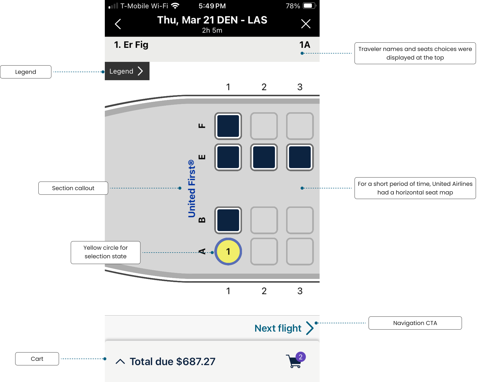
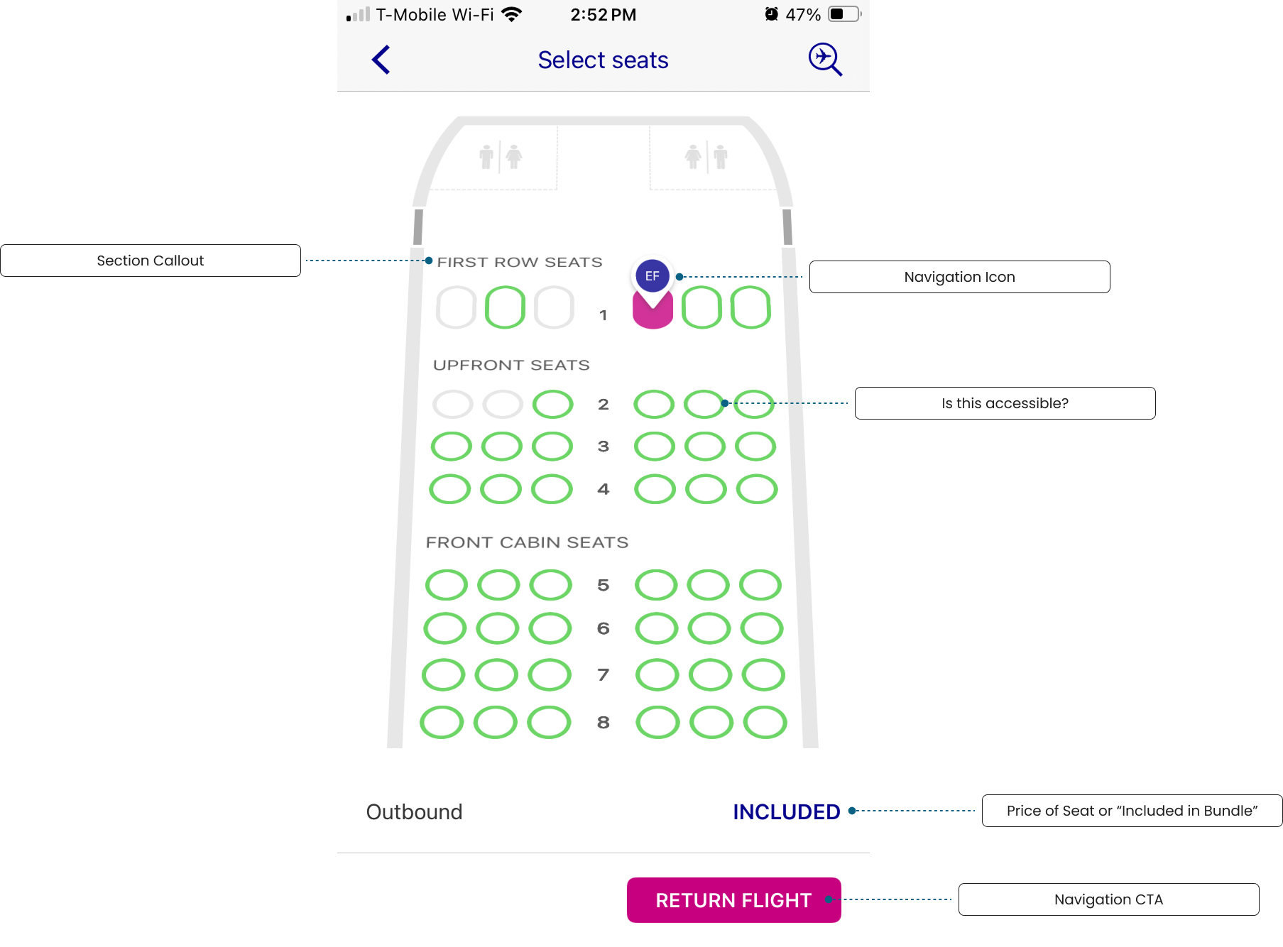
At the start of the seats redesign, we conducted a competitive analysis of several airline apps to get a sense of common patterns and unique approaches. While many of these screenshots now feel dated, they captured a clear picture of where the industry was when we began.
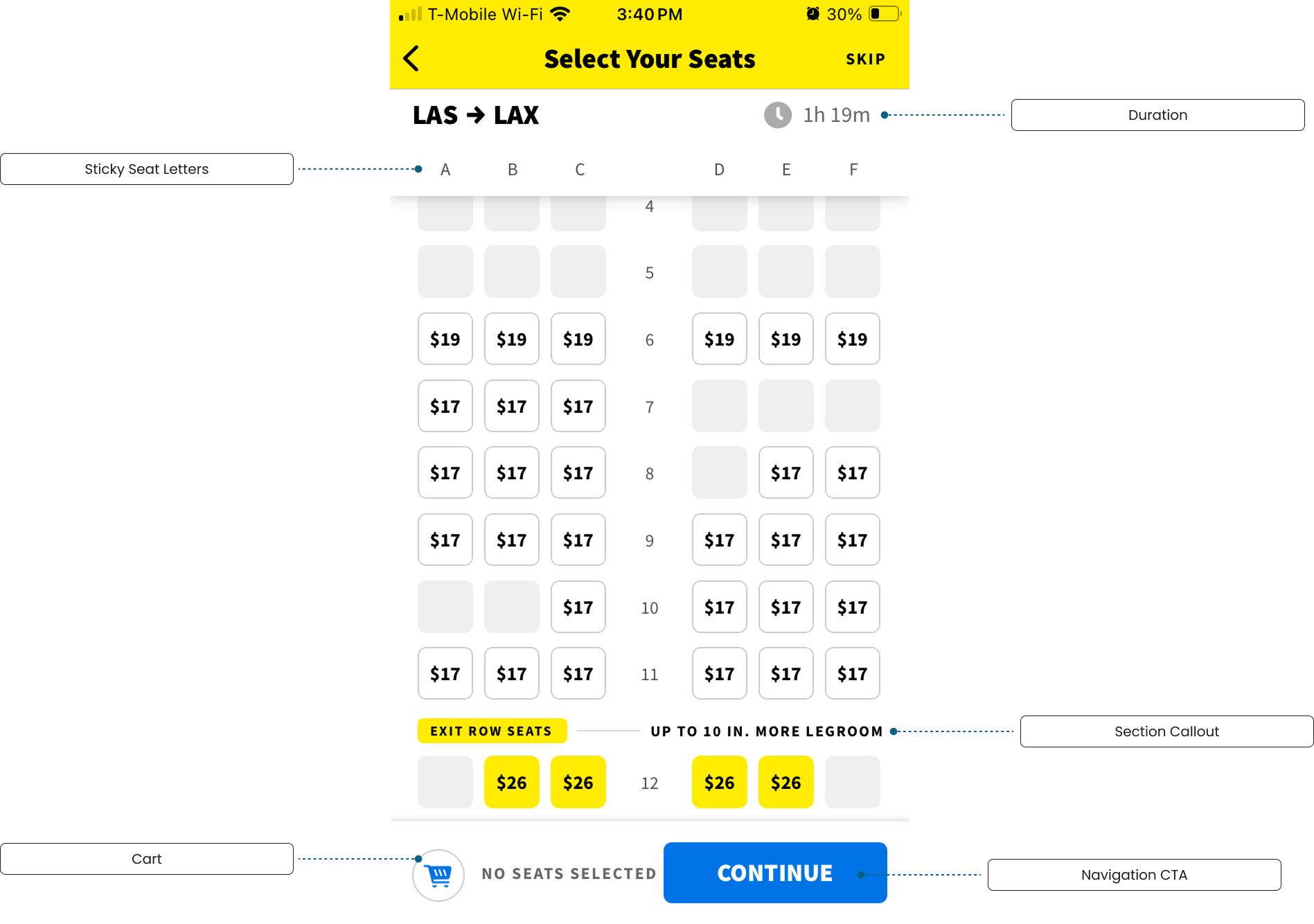
Each airline approached seat selection differently. United’s interface featured a horizontal seat map and relied on a simple link and chevron instead of a full primary navigation CTA. Wizz Air used a navigation icon as a seat indicator, an unconventional choice that caught our attention. Ryanair stood out for its clearly defined seat sections, while Spirit used sticky seat letters to help users stay oriented as they scrolled.
We also noted consistent structural choices:
Top bars were often used for flight details, legends, or passenger info.
Bottom nav areas typically held the primary CTA or cart.
Iconography played a major role in helping users quickly identify seat types and availability.
Even in just a few years, many of these flows have evolved—but this reflects where these airlines were when we began.
Sketching
In the early stages of the project, I spent a lot of time sketching—exploring layout after layout, testing different ways to organize the seat map, passenger info, CTAs, legends, and other supporting content. Seats is one of those patterns that shows up slightly differently across every airline, and even now, you can find nearly every variation imaginable still in use. That variability made it a great challenge to take on.
My goal during this phase was to cast a wide net. No idea was too scrappy or too colorful. I filled pages with different combinations and structures, pushing on hierarchy, information density, and interaction models. Each sketch was a way to test how far I could stretch the space while still preserving clarity and usability.
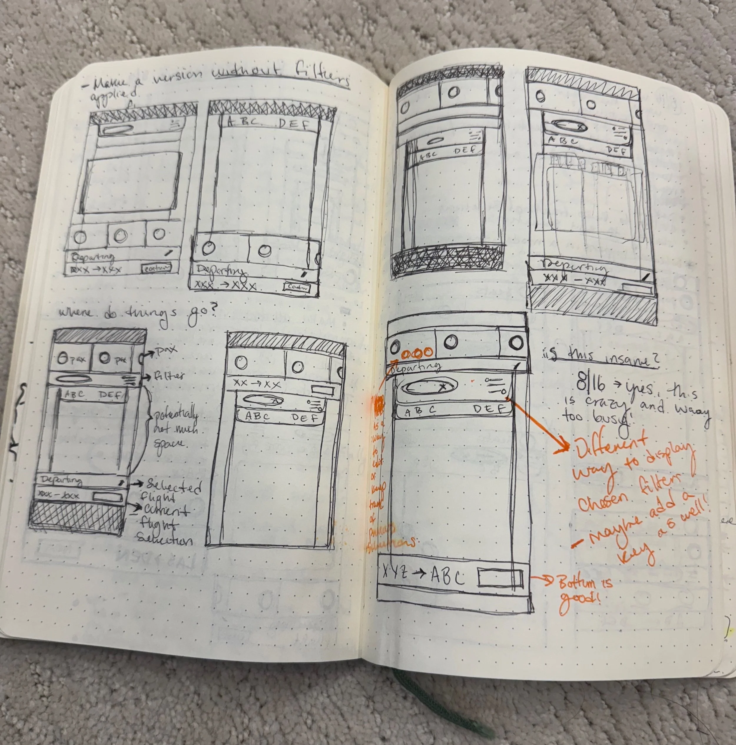
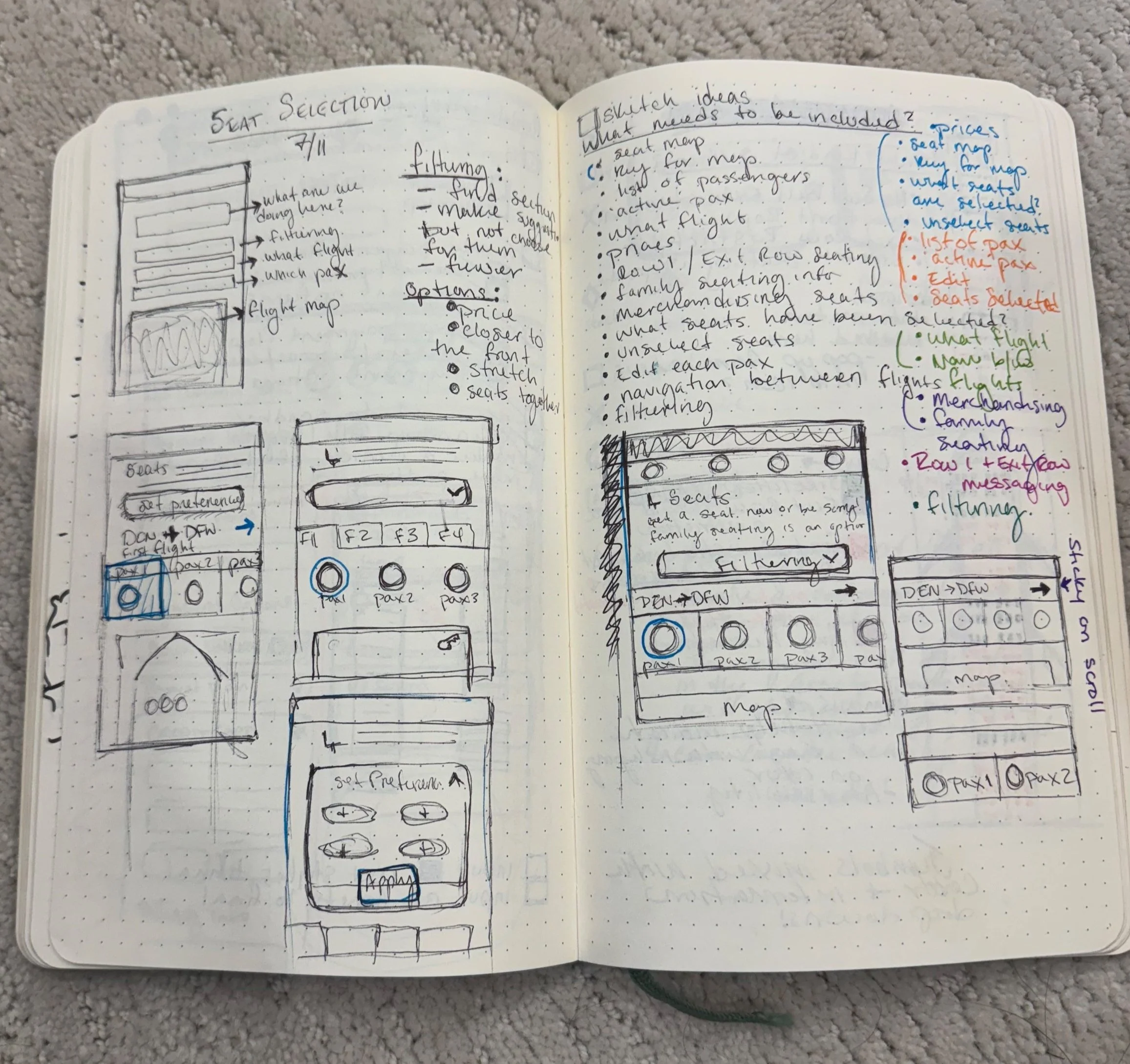
This part of the process was foundational. Not just for generating layout ideas, but for helping define what we didn’t want to do. It was an open-ended space to think visually before we moved into structured wireframes and flows.
Wireframe Iteration
We used wireframing to quickly test layout ideas and prototype potential features for the seat selection flow.
One standout idea: Seat Filtering
Inspired by Ryanair, this feature would allow users to filter seats by:
Location (aisle, window, front/back)
Perks (extra legroom, proximity to exit)
Price
Users could jump directly to the most relevant seats, streamlining selection and adding interactivity.
Why it mattered:
Performed well in early user testing
Included in two separate design iterations
Aligned with business goals as Frontier explored more advanced seat classifications
What we learned:
Helped clarify what users value when picking seats
Opened the door to future ideas around personalization or gamification
Although the feature didn’t ship, it was a meaningful part of the design exploration. It remains a strong candidate for future iterations as the product and merchandising model mature.
The Seatmap: Building a Visual Language
The Seatmap was one of the most crucial parts of this experience and one that needed to translate seamlessly across all platforms.
Early Exploration
I experimented with textures, shapes, and visual storytelling to differentiate seat types and sections.
Accessibility was top of mind, color alone wasn’t enough. Many of our palette weights were too similar, especially for colorblind users.
To help clarify seat states, I introduced distinctive shapes (e.g., circles for selected states, diamonds for others) to provide visual contrast beyond color.
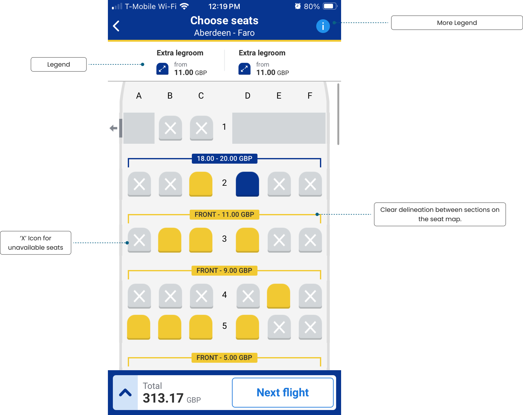
The “X” Factor
Initially, unavailable seats were shown as gray-striped but this wasn’t effective.
User testing revealed that an “X” icon was immediately recognizable and helped users quickly understand availability.
While marketing worried “X” might feel too harsh, users overwhelmingly preferred the clarity, so we leaned into it.
From the beginning, this was about more than aesthetics. It was about creating an intuitive, inclusive experience where the map could speak for itself.

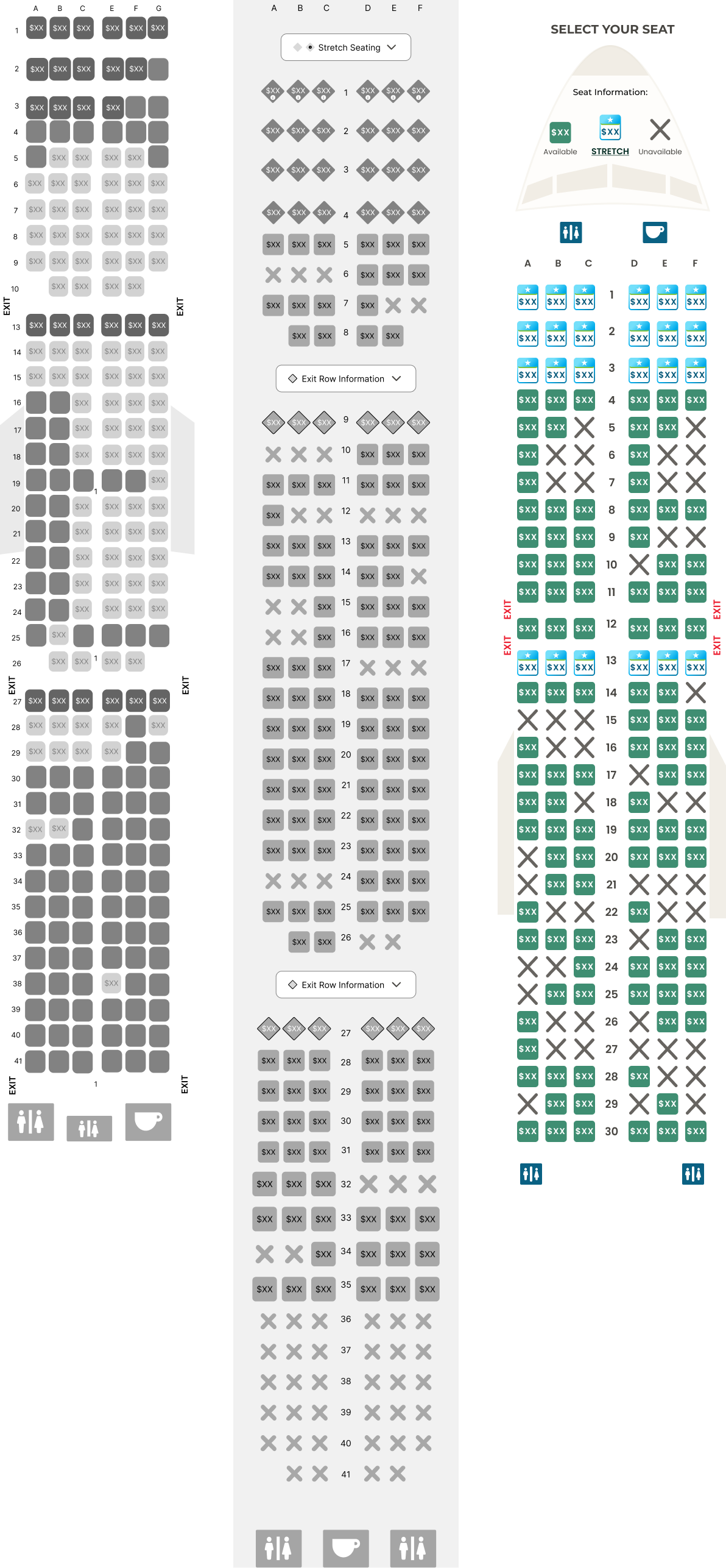
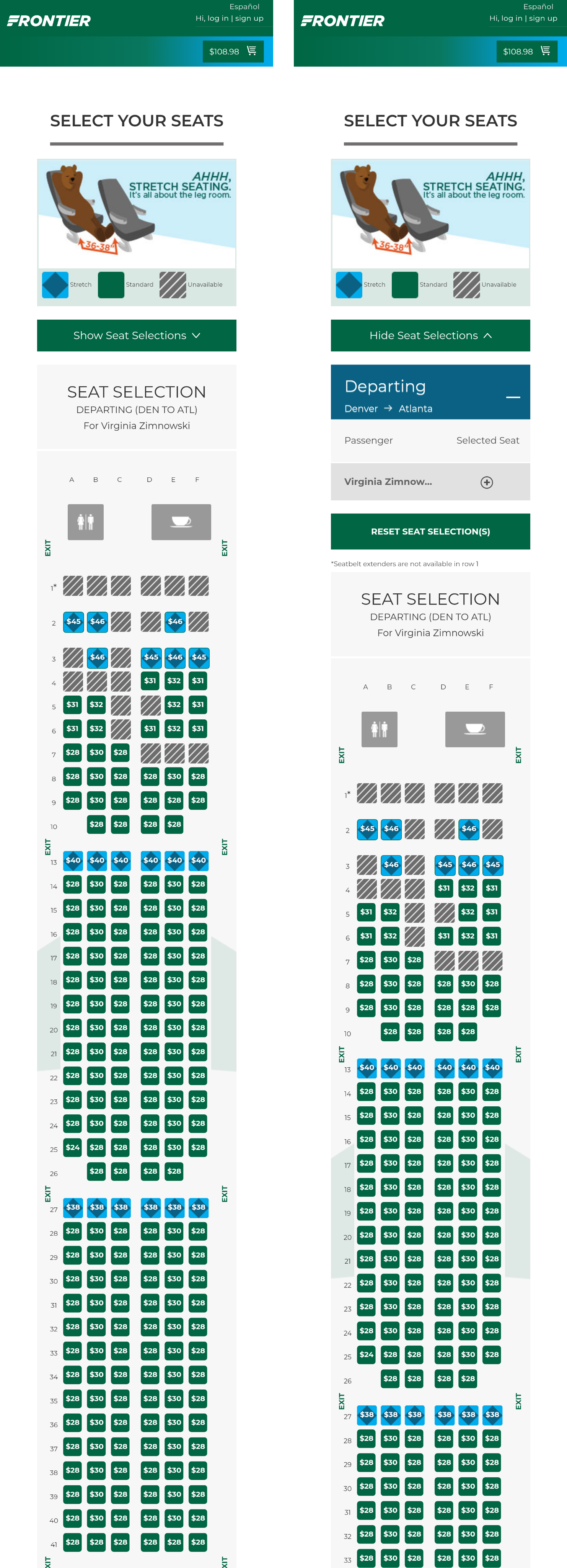
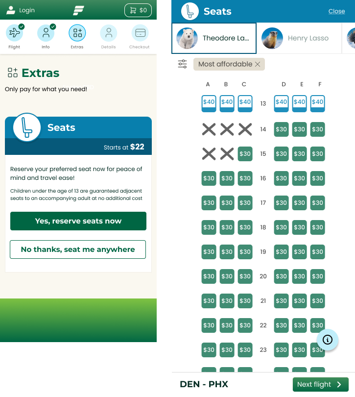
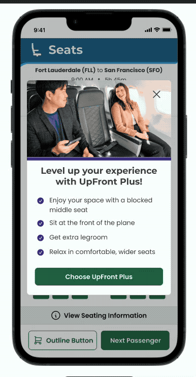
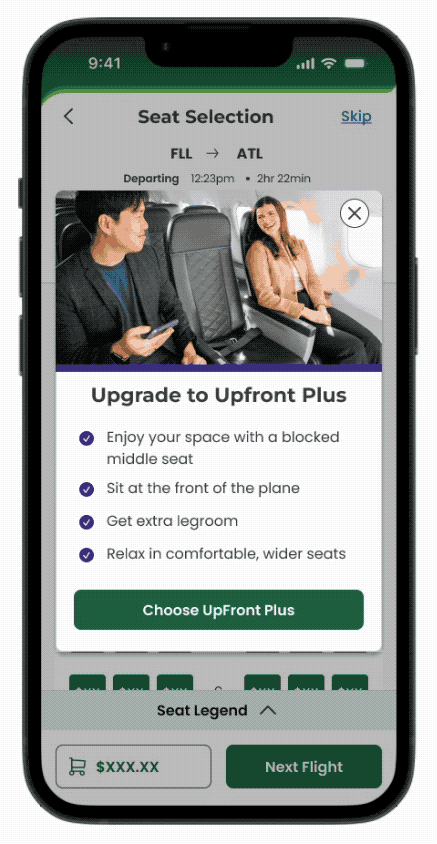
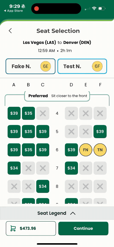
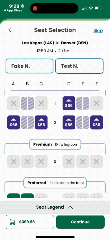
The Final Map: Designing for Merchandising
The final Seatmap design took shape after a major shift in how Frontier sold its products — specifically, restructuring seat types to align with updated bundles:
Preferred, Premium, UpFront Plus (our take on First Class), and Standard.
Designing for Merchandising
CCO Bobby Schroeder emphasized a goal: make the Seatmap a merchandising tool.
That led to a design solution that let the Seatmap act as its own legend.
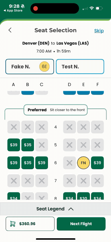
We introduced visual brackets around each section, clearly separating seat types.
Each bracket included CMS-controlled upsell messaging, giving the business flexibility to test different value propositions.
Visual & Functional Influences
Inspired by Ryanair’s bracketed layout, but we opted for a friendlier, rounded design.
A key ask was to maximize seat visibility on-screen:
Originally, I explored full outlines around sections, but trimming the brackets halfway increased seat density and clarity.
This struck a balance between merchandising and usability.
The result: a Seatmap that’s clearer, smarter, and more aligned with business needs, without overwhelming the user experience.


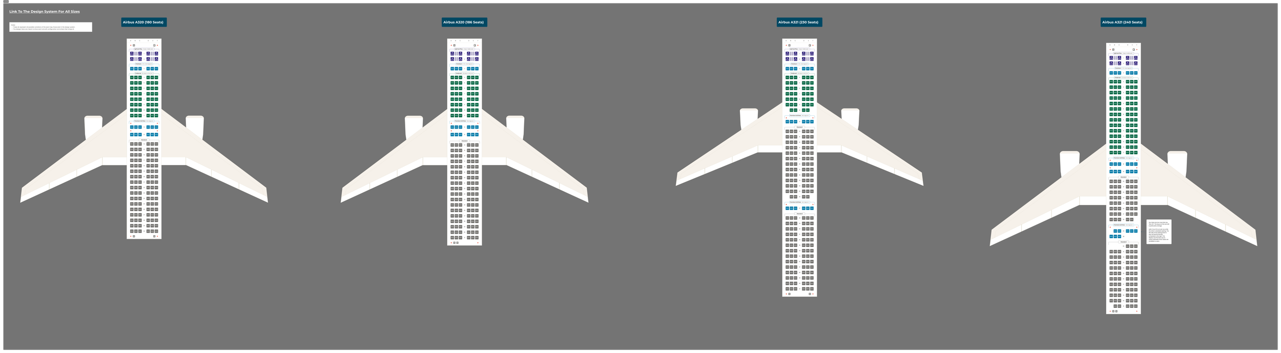
A Peek into the Design System
I've also included a snapshot of the core components used to build the SeatMap within our design system, showcasing how scalable and modular the experience was intended to be.


Letting Go and Moving on
An in-depth look at pivoting in a time crunch and the reality of scaling products
Early Concept — The Chipotle Model
In the first few iterations of the app, we anchored much of our thinking around what we called the “Chipotle model.” The name started as a bit of fun, but it captured a key intention: to move away from the feeling of hidden fees and instead offer users a build-your-own-trip experience, much like assembling a burrito.
The idea was to present all of Frontier’s extras—seats, bags, extras and bundles—on a single, scrollable screen. Users could tap into any option and launch a drawer-style flow to customize that part of their trip. The model was loosely based on the structure of the original app and seemed like a flexible, user-friendly approach that could carry over into the redesign.

This was the direction we were committed to for a while but as we pushed further into designing around a changing landscape of industry trends and stakeholder needs we’d eventually learn to let it go.
A Shift in Timeline—and in Process
Up until this point, qualitative user testing had been a core part of our workflow. Designing across web, web responsive, and native app—always mobile-first—we relied on real user feedback to shape everything from seatmap interactions to overall flow.
But partway through the project, our timeline shifted. The native mobile app became the top priority, and to meet new business goals, stakeholders made the decision to pause user testing in order to accelerate delivery.
This was a significant change.
Web and web responsive were pushed to a later phase.
Our team turned full attention to shipping native mobile on a condensed schedule.
And from that point forward, we were no longer validating directly with users.
While we still gathered internal feedback, it wasn’t a full substitute—and we felt the impact.
Later in the process, closer to launch, we’d begin exploring ways to reintroduce user insights through tools like FullStory, but at this stage, it was heads-down execution.
Rewinding for a Moment: The Header Redesign
As I pointed out in my last case study, this was the moment when we regained control of our designs, pivoting away from the fragmented “build-your-own-trip” model (aka the Chipotle model) toward something simpler and more scalable.
Originally, our bold blue headers were designed to anchor product drawers within a segmented booking experience. But when stakeholders moved toward a more standard, linear flow, those headers lost their meaning—floating at the top of screens without offering real context or value.
This shift led directly to a redesign of the header system. We focused on simplifying the experience: giving the headers a more streamlined, contextual role that better matched the updated booking structure, and laid a stronger foundation for the seat selection work that followed.


Clear Painpoints in the Seats Flow
At the same time, the seat selection experience was unraveling.
With many voices at the table and shifting priorities, the design began to buckle under the weight of complexity. At one point, users were completely trapped in the flow, no clear exits, no way to skip flights, and an overwhelming number of steps.
Too many clicks
No flexibility between passengers or flights
Minimal user control
And without ongoing user testing to validate these decisions, we couldn’t catch just how much friction had built up.
This became a pivotal moment for me as a designer. While I deeply respect the realities and trade-offs a business has to make, this phase made it undeniably clear: qualitative feedback is not optional. Without it, it’s far too easy to lose sight of what users actually need—especially in complex flows like this one
Back to the Drawing Board
New Concept to Product release
Defining Scope and Going Back to Competitive Analysis
The header redesign gave me the starting point for reframing the seats experience altogether.
As part of this effort, I revisited our competitive analysis. This time casting a wider net and pulling more recent examples from other airlines. A lot had changed since our initial review. Many competitors had clearly iterated, incorporating insights from their own usability testing to improve structure and flow.
From this, I established clear goals for the redesign:
Clarify the seat selection process
Support intuitive transitions between travelers
Make flight-to-flight navigation easier
Ensure users had a clear way to exit the seat map
This research helped guide a focused, rapid iteration—one that reset the foundation for a simpler, more intuitive seat selection experience.

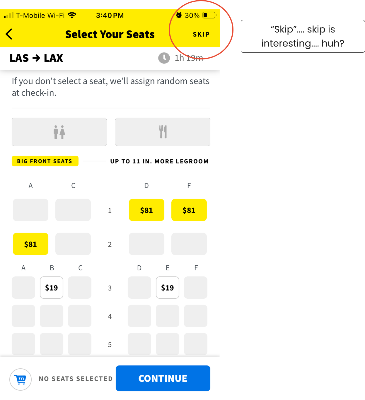
One particular element became my design North Star: the chevron. It stood out as a subtle but powerful way to guide user expectations and flow, helping anchor the structure of each screen. As I built around it, I also paid close attention to Spirit’s skip functionality.Especially with our tight timeline and an already defined functional scope, it became a key reference point for thinking about how users could move through the flow more flexibly.
Designing for Now, Planning for Later
I explored several ways to improve flight-to-flight navigation, but ran into two major issues: inconsistency across headers and overly crowded layouts.
After working closely with product owner, we decided the best path was to simplify. Instead of overbuilding, I focused on a clean design that met current needs and could easily evolve later.
We had a strong iteration plan and version control in place, so this approach gave us flexibility to refine and expand in future releases—without slowing down delivery.

Prototyping the Complexities
Switching between flights was a major focus, but it was just one part of a much larger puzzle. I created multiple rounds of prototypes exploring:
How editing and selection would work
How users would interact with multiple flights
How and when the legend would appear
How to streamline the overall experience without losing clarity
Each prototype helped unpack different layers of complexity, but it also helped me unlock the interaction design that brought the UI together.
Scope was tricky, a lot had been developed so the usability changes needed to be simple. It was another race against time but ultimately, we landed on the version that could easily scale in the future.

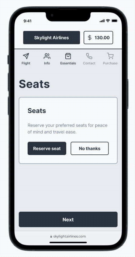
The Final Prototype and Design Decisions
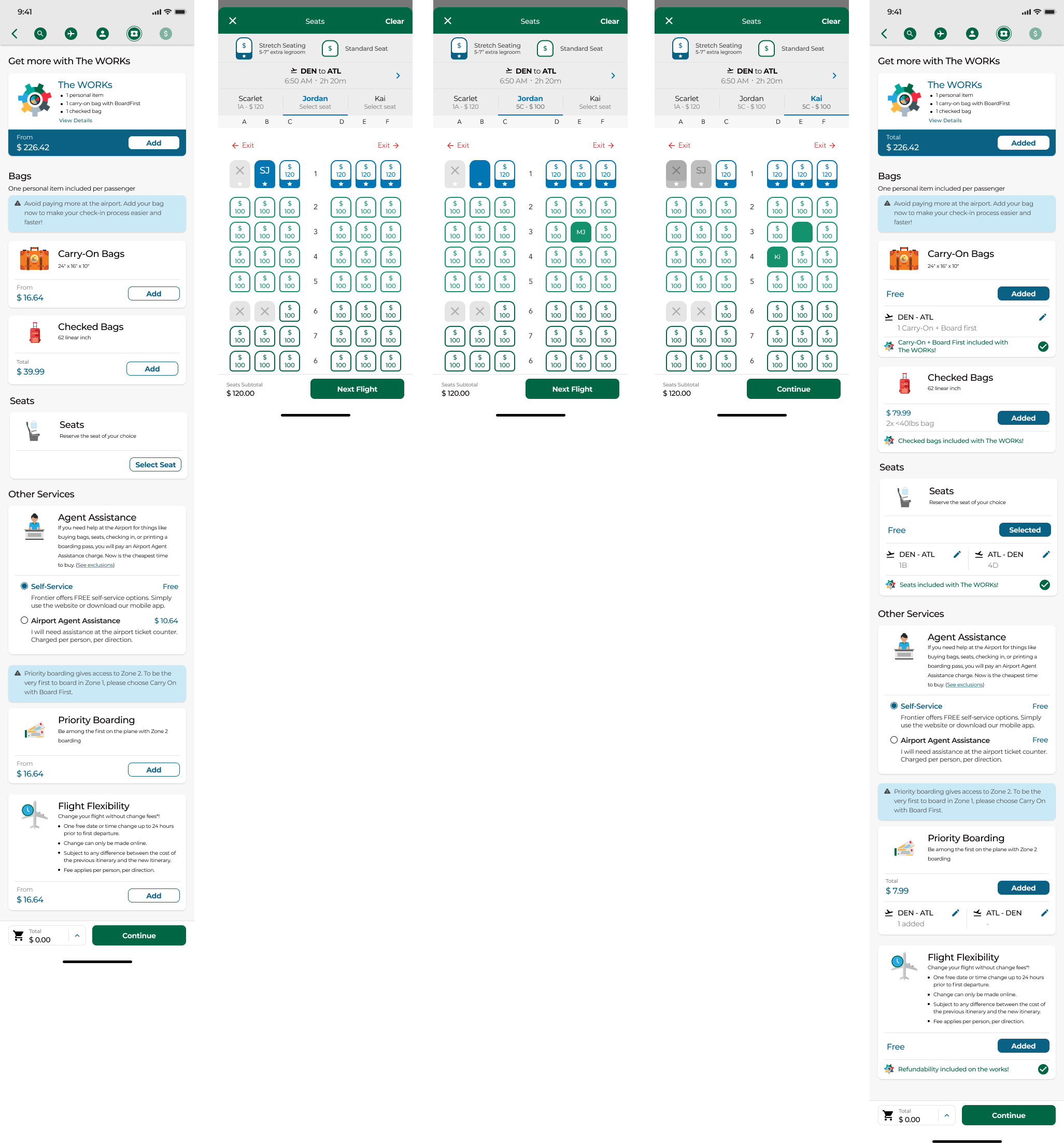
For this iteration, the best decision within scope was to keep flight navigation simple—so I leaned into a "Skip" feature, inspired by Spirit. While it doesn’t work exactly the same, the clean UI offered flexibility and a strong foundation for future growth.
Skip lets users bypass seat selection, with strategic prompts reminding them this is the cheapest time to buy.
This approach balances user autonomy with business needs, nudging users without trapping them.
Flight Navigation:
While “Skip” handles movement between sections of the booking flow.
The bottom CTA guides users with a clear journey:
Next Flight → Continue(final flight)Travelers auto-advance, but flights do not, giving users control.
Future iterations (like in mobile responsive) will explore auto-advancing flights and more robust navigation patterns.
What is Live Today
And what’s next?
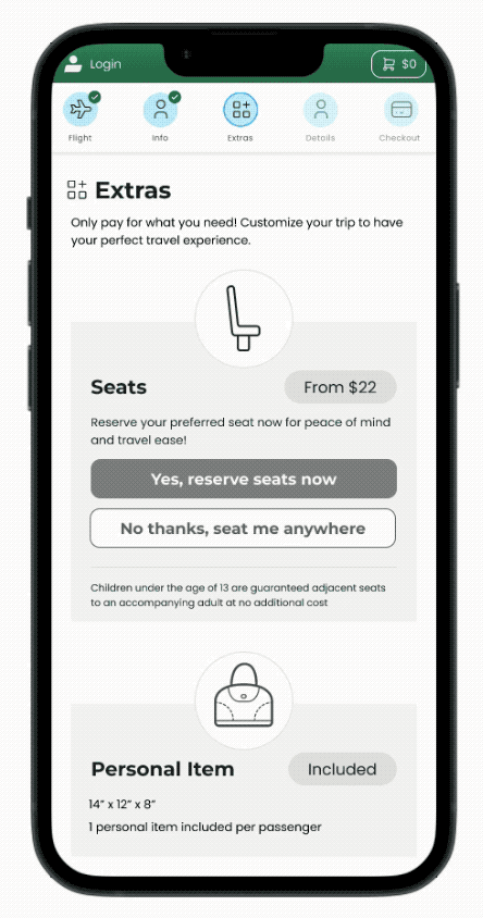
Interruption Messaging: Balancing UX and Business Goals
As part of the skip and next flight functionality, we included two key interruptions that served both user experience and business needs:
1. “Are You Sure?” Message
This interruption acts as both a safety net and an upsell opportunity. It’s triggered when a user skips ahead without selecting seats. While it helps prevent accidental taps, its primary purpose is persuasive:
“Now is the best time to buy.”
“Prices only go up from here.”
“Lock in your seat.”
These messages are designed to guide users toward informed decisions while driving conversions.
2. “Not Everyone Has a Seat” Message
This is more of an error prevention prompt. It appears when not all travelers have selected seats. For example, if a parent buys a seat for a child but not for themselves, this prompt allows them to proceed, but only after acknowledging that not everyone is covered. It ensures users don’t accidentally overlook a step while still respecting intentional choices.
While I'm not typically a fan of interrupting the user journey, these modals were a necessary compromise. Frontier’s unbundled pricing model relies heavily on upsells, so these strategic interruptions aim to both support the business and protect the user experience.

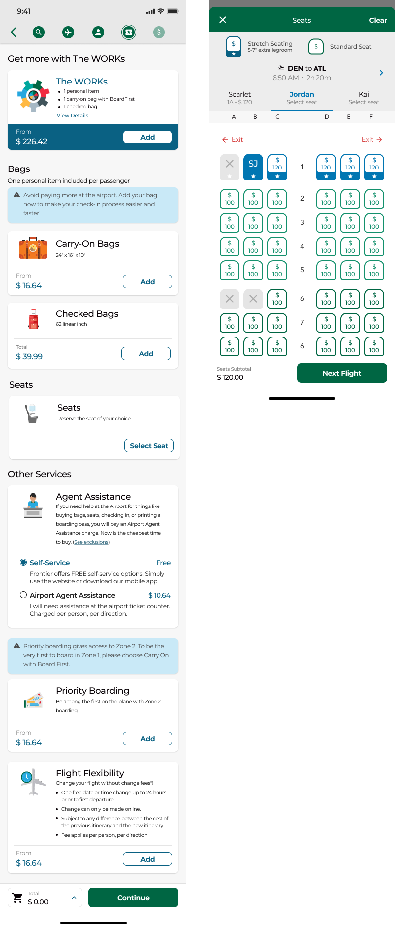
Seat Selection: Usability-Driven Visuals and Interaction
The selection process was refined when new business goals prioritized showcasing seat details. We introduced a modal that appears when users tap on a seat icon. This modal includes:
A photo and brief description of the seat
Upgrade options when applicable
A "Select" CTA to confirm their choice
Once a seat is selected, the selection state is reflected in both the traveler indicator and the seat icon on the map.

A Bold, Usability-First Visual Choice
One of the biggest changes came from an earlier user testing insight: users couldn’t tell when a seat had been selected. To solve this, I made the intentional choice to use yellow for the selection state, both on the seat map and the traveler indicators.
Why yellow?
Inspired by United’s use of it, yellow is highly visible and accessible against dark backgrounds.
It was also one of the few remaining standout colors in our already colorful UI.Why a round icon?
To further improve accessibility, I introduced a round shape for selected seats. This helped provide a non-color-based cue, supporting users with vision limitations or color blindness.
While the design may feel playful, every detail—from color to shape—was focused on enhancing usability and ensuring users felt confident in their selections.

Legend Design: Functional, But Room to Improve
The seat map legend lives in a bottom sheet, tucked away but easy to access. It’s triggered by a tonal button, a pattern reused from other parts of the app.
While the button style isn’t ideal, it keeps the experience consistent. The interaction is clear and performs well, according to Full Story data.
Long-term, I’d like to revisit the visual styling to better align with the rest of the UI.
Cart & Editing: Lessons in Scope and Communication
Originally, the cart was designed to support editing, allowing users to modify seat selections directly. But just before production, that functionality was cut from MVP due to scope constraints.
As a result, editing is now limited to:
Tapping the traveler indicators
Tapping seat icons on the map
While this pattern is common across airlines and likely intuitive, we didn’t get to validate it through user testing, something I’m eager to revisit in future iterations.
This experience reinforced how tight timelines demand crystal-clear communication, role clarity, and constant reevaluation of scope vs. usability.
To Be Continued…
The next phase of seat selection design continues in Web Responsive and Desktop, and it’s some of the work I’m most proud of. While it’s still unreleased (and will be password-protected published), it solves many of the challenges from this mobile app iteration:
Improved navigation between flights
Refined traveler indicators
Cleaner UI and legend treatment
A clean, well organized desktop display and flow
Accessibility improvements for the seat icons
There’s still more to do, whether that’s me continuing the work or passing the baton. With FullStory insights and renewed focus on user testing, there’s plenty of room to grow this experience.
Designing this flow has been a career-shaping opportunity. It’s a complex challenge full of delicate micro-interactions, and one that’s been deeply rewarding.
Big thanks to Frontier Airlines. Balancing usability with business needs isn’t easy, but this project taught me so much about strategic design in a fast-paced environment.